
Quick Answer:
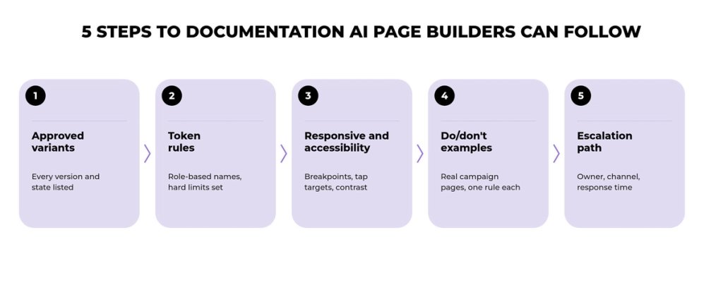
To make an AI page builder use your design system, put approved components, design tokens, constraints and escalation rules into the context the builder works from: a connected component library, CMS modules or documentation supplied with the prompt. For each component, that documentation should cover approved variants, token rules, responsive and accessibility behavior, do/don't examples and an escalation path.
TL;DR
- An AI page builder follows your design system only when it can access the rules at build time, through a connected component library, CMS modules or documentation supplied as context.
- Useful documentation specifies approved variants, token rules, responsive and accessibility behavior, do/don't examples and an escalation path for every component.
- Only 38% of design systems reach wide or full adoption, and documentation completeness is one of the strongest markers of that adoption.
- Documentation guides people and compatible AI tools, while CMS module constraints, component libraries and review gates enforce the rules.
- Start with the five to ten highest-traffic components and make documentation updates a required part of every component release.
Marketing teams now build campaign pages with AI page builders and AI-assisted development, and for many teams the production cycle for a campaign page has become noticeably shorter. Each generated page also makes small decisions about spacing, button styles and component choice. Over repeated launches, those decisions can add up to a site that drifts away from its own design system.
The usual cause is a documentation gap. Many design systems were documented for designers and developers, often in a PDF or a Figma page that marketers and their AI tools do not open while they build. When a builder has no access to that intent, it produces layouts the system never approved. This guide covers what design system documentation needs to specify, where it should live and how to keep it current.
Four Conditions for On-Brand AI Page Production
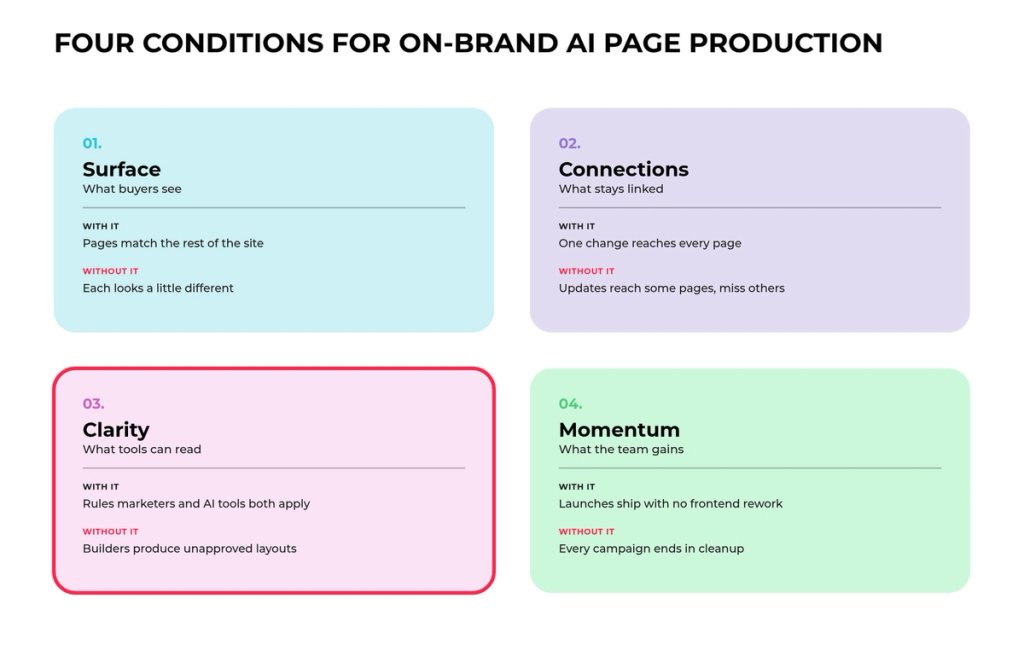
On-brand AI page production rests on the four pillars of the Darwin Flux model: Surface, Connections, Clarity and Momentum. Surface is what buyers see on each campaign page, and Connections tie components, design tokens and CMS modules to one set of definitions. Clarity makes component rules readable for marketers and AI tools, and Momentum follows from the first three as faster launches with no repeated redesign or frontend rework. Documentation does most of its work in Clarity, and the sections below show what that work involves.
What AI Page Builders Need From Your Design System
AI page builders need access to your design system in a form they can use at build time, and the form of that access depends on the tool. AI coding agents read component code and documentation when a connector such as an MCP server exposes it. CMS-based page builders work with the modules and fields the CMS defines, and Figma-connected tools read design data such as variables and component properties.
A tool with none of these connections works only from the prompt and whatever documentation the team supplies with it. Rules that sit in a slide deck or in a designer's head do not reach that output.
"AI makes design systems more critical than ever. Because AI generates code. Design systems generate understanding." – Romina Kavcic, Design System Lead, The Design System Guide
Design Tokens
Design tokens are named values for color, typography, spacing and other visual decisions, and they are the first thing a connected tool can apply consistently. A token such as color-brand-primary replaces a raw hex code scattered through dozens of files, so every page that references the name gets the same value.
Material Design organizes tokens in three tiers. Reference tokens hold the available values, system tokens assign roles such as primary or surface color and component tokens apply those roles to a specific element like a button. A role-based name tells a model what a value is for, which a hex code cannot do.
Component Libraries and Style Guides
A component library holds the coded building blocks a page builder can place, while a style guide explains brand, content and visual rules in prose. Nielsen Norman Group describes the style guide as one part of a design system, next to component and pattern libraries.
Coding agents work best with coded components and tokens, and every tool still needs the intent of the style guide written as explicit rules attached to each component. Writing those rules is the job of design system documentation.
How Documentation Shapes AI Output
Documentation shapes whether AI output reuses your system or invents a parallel one. Storybook cites the 2026 Zeroheight Design Systems Report, in which only 38% of design systems were widely or fully adopted within their organizations, with documentation completeness as one of the strongest markers of adoption.
AI agents show the same dependence. In Storybook benchmarks that generated UI with the Reshaped component library, agents with access to the Storybook MCP server produced 12.8% better component usage, ran 2.76 times faster and used 27% fewer tokens than agents without it. The Zeroheight report also found that documentation generation tops the list of AI advances design system teams are most excited about (57%), yet only 12% currently use AI to deliver documentation to the tools where it is needed.
Why a Static Design-System PDF Falls Short for Marketing Teams
A static design-system PDF falls short because it is hard to keep current and is often unavailable to the tool at build time. A current PDF supplied in context can still help. Marketers, though, work in the page builder, the CMS and the AI prompt window, and a file in a shared drive is one more place they need to remember to check.
A static PDF can fall out of sync as soon as a component changes. Once a team finds one outdated page, trust drops, and people start making their own calls on button labels, layouts and component choices. An AI tool that receives the outdated file has no way to tell, so it applies the old rule.
Usable documentation sits inside the tools where pages are assembled and stays attached to the components themselves, so marketers and connected tools read the same rules in place.
Step-by-Step: Documentation Rules AI Page Builders Can Follow
AI page builders can follow documentation built in five steps, one for each rule every component needs: approved variants, token rules, responsive and accessibility behavior, do/don't examples and an escalation path. Written as short, structured entries, these rules give marketers and AI tools the same answer to the same question.
Step 1: Define Approved Variants and States
Define approved variants by listing every version of a component the team may use, with the properties that define each one. Figma variants group related versions of a component into one set with properties such as size, state and type, which gives documentation a natural structure to follow.
Give each variant a one-line purpose. A builder that knows the destructive button exists only for irreversible actions is far less likely to place it on a newsletter signup. List every state the component supports, including default, hover, focus, disabled and error, so the tool has no reason to invent a state the system does not define.
Step 2: Set Design Token Rules
Set design token rules by stating which tokens each component may use and in which contexts. Semantic names do most of the work here: a pattern like category-property-modifier produces names such as color-background-hover, which tell a tool what the value is for. Consistent token naming also gives marketers and developers the same words for the same decisions.
Document the hard limits too. If campaign pages may never use raw hex values or off-scale spacing, the documentation should say so, and every AI-built page can then be checked against that rule.
Step 3: Specify Responsive and Accessibility Behavior
Specify responsive and accessibility behavior by describing how each component behaves at each breakpoint and for each user, the part static screenshots tend to miss. Specify how a hero block stacks on mobile, which elements may be hidden on small screens, minimum tap-target sizes, required alt text and the contrast pairs approved for text on each background.
Storybook recommends documentation that renders live components, because readers can then interact with every state in the browser. Live examples also give coding agents connected to the component library a working reference for behavior that a flat image cannot show.
Step 4: Add Do/Don't Examples From Real Campaigns
Add do/don't examples by placing one correct use of a component next to a common mistake, since paired examples are often the fastest rule for a marketer to absorb. Pair each example with one sentence that explains what to notice, and write the same rule as text for AI tools, since a model that receives only an image may miss the point.
Pull examples from real campaign pages where possible. A card layout that worked on last quarter's webinar page teaches more than an abstract mockup built for the documentation.
Step 5: Create an Escalation Path
Create an escalation path that tells a marketer or an AI tool what to do when no approved component fits the page. Without one, people improvise, and each improvised block can become a near-duplicate of something the system already has.
Name the owner who approves new patterns, the channel for requests and the expected response time. Instruct the AI tools your team uses to flag the gap so the request reaches that owner, and fold approved patterns back into the library once they prove reusable.
How to Drive Design System Adoption on the Marketing Team
Design system adoption on a marketing team grows when documentation answers real campaign questions quickly, so start with a small scope and expand it based on usage data.
Start With the Highest-Traffic Components
The fastest start is to document your five to ten highest-traffic components completely, with usage rules, tokens, code references and accessibility notes. On a marketing site, that list usually includes the hero, buttons, cards, forms, testimonial blocks and the CTA banner. The rest of the library can follow once those pages prove useful.
Write for Non-Technical Readers
Write each rule so a campaign manager can apply it with no designer in the room. Brand managers, content writers and campaign teams who lack specific instructions make their own calls on labels, layouts and component choice. Short rules in plain words, each with one example, keep the documentation usable for them and for the AI tools they prompt.
Measure What People Look For
Usage data shows where documentation needs work next. Track which pages get the most visits and which searches return nothing, then add short interviews to the page-view data, as Figma suggests, to learn how documentation changes behavior. Repeated questions about one component usually mean its rules are unclear.
Keep Documentation in Sync With Every Release
Documentation stays useful when updating it is part of shipping a component, so make the documentation change a required step in the same release. Version the design system, keep a changelog that lists new components, breaking changes and migration steps and name an owner for each area. Storybook Autodocs generates a documentation page for each component from its stories, so props and variants update when the code changes.
Stale documentation does double damage once AI tools are involved. A person who spots an outdated rule can ask a colleague, while a connected tool can repeat the outdated token on every page it builds. Review AI-built pages against the documentation at launch and feed every recurring correction back into the rules.
Where Design System Documentation Should Live
Design system documentation should live in the tools where each audience already works, with every copy tied to the same definitions. Designers work in Figma, developers in Storybook or the code repository and marketers in the CMS and the page builder. Figma's guidance on documentation notes that smaller teams often start in Notion or Confluence, and many teams combine technical specs in Storybook with design guidelines in more accessible formats.
"One of the most challenging things when it comes to keeping consistency is determining where your source of truth is." – Raul Menezes, Lead Design System and iOS Engineer, Bumble
For marketing teams assembling campaign pages, the CMS can become one of the most important enforcement points. When pages are built from CMS modules with defined fields and allowed options, a builder cannot pick a variant the module does not offer.
That is the line between documentation and enforcement. Documentation guides people and compatible AI tools, while CMS module constraints, component libraries and review gates enforce the rules. Written rules alone do not guarantee on-brand output, so the strongest setups pair them with enforcement in the stack.
Documentation Sources Compared
Each documentation source serves a different audience, and the comparison below shows what each one should hold and how AI tools can use it.
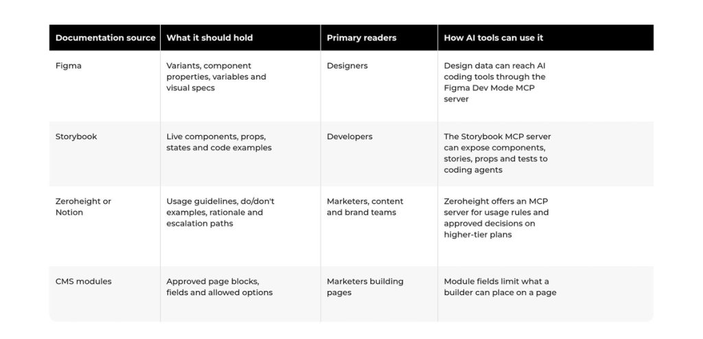
Integration capability, access scope and available context vary by tool, connector and plan, so treat each row as a starting point and confirm what your own stack exposes.
Marketing-Owned Pages Built on Documented Rules
Documentation protects the brand only when the publishing stack can enforce it. If every campaign change still needs a developer, marketers route around the system, and AI tools make that shortcut faster.
Darwin saw this pattern with Zeplin Inc. Its marketing website was hard to update, and the marketing team relied on developers for every change. Darwin rebuilt the website and blog on Sanity CMS, which allowed the marketing team to self-manage the website and blog with minimal reliance on developers, and integrated Mixpanel, HubSpot and Optimizely into the site. Zeplin's Marketing Director noted that the company's designers described the website development as pixel perfect.
AI page builders raise the stakes on that kind of setup. A CMS with structured modules gives marketers ownership of pages, and documented component rules give connected tools the boundaries the team already works within, so campaign pages can ship fast and stay on brand.
FAQs
Q1. What should design system documentation include for AI page builders?
It should include approved variants, design token rules, responsive and accessibility behavior, do/don't examples and an escalation path for each component. Write each rule as short structured text so marketers and AI tools read the same instruction.
Q2. Can AI tools read design system documentation in Figma or Storybook?
Some can, through connectors. The Figma Dev Mode MCP server exposes design data to AI coding tools, and the Storybook MCP server gives agents access to components, stories, props and tests. Tools without such connectors depend on rules supplied as context.
Q3. Who should own design system documentation on a marketing team?
Name one owner for each area, often a design system lead for components and a marketing ops or web lead for CMS modules. The owner approves new patterns, answers escalations and keeps documentation updates in every release.
Q4. How do you spot design drift on AI-built campaign pages?
Compare live pages with the documented components. Look for raw hex values, off-scale spacing, near-duplicate components and states the system does not define. A rendered-page audit can score drift on desktop, tablet and mobile views.
Q5. How often should design system documentation be updated?
Update it in the same release as every component change, so documentation keeps pace with the code. Add a quarterly review of usage data and recurring questions to catch rules that have become unclear or outdated.