Quick Answer
A website header is the band at the top of every page that holds your logo, main navigation and one primary action. A strong header loads fast, stays readable on mobile, meets WCAG contrast and focus rules and uses crawlable links so visitors and search engines can find key pages.
TL;DR
- People form a visual judgment of a web page in about 50 milliseconds, and the header sits inside that first view.
- Place the logo top left and link it to the homepage: in NN/g testing, a centered logo made users 6 times as likely to fail a one-click return home.
- Keep the main navigation visible and short, with plain labels that match how visitors describe your offer.
- Give the header one primary CTA button with a specific label.
- Sticky headers help on long pages when they stay slim and opaque and never cover focused elements (WCAG 2.4.11).
- Build menus with standard
<a href>links so Google can crawl every page they point to.
Your website header appears on every page, so it does more work than any other block on your site. It tells visitors whose site they are on, where they can go next and what action you want them to take. Research reported by Nature found that people form a visual judgment of a web page in about 50 milliseconds, and the header is part of that first glance.
This guide covers the elements every header needs and the best practices that hold up in 2026. It also walks through common mistakes, three real examples and the way header markup affects SEO and AI search.
What Is a Website Header?
A website header is the repeating top band of a site that identifies the brand and gives visitors their main routes through it. In HTML it has its own elements, and it is separate from the H1 to H6 headings inside page content.
A Simple Definition
A website header is the top section of a page that repeats on every page of the site. It usually holds the logo, the main navigation menu and one or two actions such as a login link or a demo button. Some headers also include a search field, a language selector or a slim announcement bar above the menu.
In HTML, this section sits inside a <header> element and the menu sits inside a <nav> element. MDN documents both elements, and screen readers use them as landmarks to jump straight to the menu.
Website Header vs. Page Headings
A website header and a page heading are two different things. The header is the repeating bar with the logo and menu, while headings are the H1 to H6 titles inside the content. Yoast notes that well-structured headings help people read an article, improve accessibility and might help SEO. This guide focuses on the header bar.
Why the Website Header Matters
The website header matters because it decides whether visitors can reach their next page in one click. When navigation is hard to see, people use it less. In a Nielsen Norman Group study on hidden navigation, desktop users used hidden menus in only 27% of cases, compared with 48% for visible navigation.
The header also carries your brand. The logo, type and color in this strip repeat on every page, so visitors learn to connect them with your company. A header built on the same design principles as the rest of the site feels consistent, and a header that clashes makes the site look assembled from parts.
On B2B sites, the header holds the highest-intent links on the page: pricing, login, contact and demo requests. When those links are easy to spot, sales-ready visitors reach them faster.
Why Header Changes Affect Analytics, Integrations and Marketing Workflows
Header changes affect analytics, integrations and marketing workflows because header links and buttons are where many visitor journeys begin. Moving a menu item, renaming a button or replacing a demo form can change which events fire, which CRM fields fill in and which reports your team trusts. The Darwin Flux operating model groups these dependencies into four pillars.
- Surface covers what visitors see first: the logo, the menu labels and the primary button.
- Connections covers where header links and forms lead, including the CRM and tool integrations behind a “Book a demo” click.
- Clarity covers the shared numbers that show which header items people use and which ones they ignore.
- Momentum covers the regular review cycle that turns those numbers into header changes.
A header redesign that skips Connections and Clarity can look better and still break tracking. This website redesign checklist explains how to protect conversion data during that kind of launch.
If your header needs a full rethink, the System & UX Design service covers navigation, layout and the design system behind them.
Key Elements of an Effective Website Header

An effective website header combines up to seven elements: a logo, a navigation menu, a primary CTA, search, contact or login links, a language selector and sticky behavior on long pages. Pick the ones your visitors use and leave the rest out.
1. Logo Placement
On sites in left-to-right languages, place the logo in the top-left corner and link it to the homepage; right-to-left sites, such as those in Arabic or Hebrew, mirror the layout. Left placement matches what users of left-to-right sites expect, and two NN/g studies support it. In the first, brand recall was 89% higher with the logo on the left than on the right. In a second study on centered logos, users were 6 times as likely to fail to reach the homepage in a single click. Kathryn Whitenton, who wrote that study for NN/g, summarized the result in one line.
“On sites with left logos, users are significantly more likely to navigate home in a single click.” – Kathryn Whitenton, Nielsen Norman Group (2016 study)
Keep the logo file small and sharp. An SVG scales cleanly on high-density screens and loads quickly.
2. Navigation Menu
Keep the main navigation visible on desktop and limit it to the sections visitors need most. Five to seven top-level items is a common guideline, and the right number depends on your content. Use plain labels such as “Pricing” or “Services” so visitors know what sits behind each link.
Dropdown or mega menus help when you offer many services. Group items by visitor task, keep labels short and build every item as a real HTML link, since search engines follow links (see the SEO section below).
3. Primary CTA Button
Give the header one primary button and style it so it stands out from the menu links. Shopify pairs a “Start for free” button with a “Log in” link, which shows how one main action and one quieter link can sit side by side. Three competing buttons split attention.
Match the button to the stage your visitors are in. On a B2B SaaS site, “Book a demo” or “Start free trial” tells visitors more than “Learn more”. If you run paid campaigns, keep the header button consistent with the main action on your landing pages.
4. Search Bar
Add a visible search field when your site has many pages, such as a documentation hub, a large blog or a product catalog. On smaller marketing sites, a search icon that expands on click saves space. Check that search results pages return relevant content, because an empty results page can frustrate visitors more than having no search box.
5. Contact and Login Links
Place login and contact links on the right side of the header, where returning users expect them. Customers who sign in daily should reach the login page in one click. Add a phone number to the header when calls drive revenue, as with local services or support-heavy products.
6. Language Selector
Add a language selector when you publish the site in more than one language. Label each option in its own language, such as “Deutsch” or “Español”. Avoid flags, since a flag stands for a country and many languages are spoken in several countries.
7. Sticky Header Behavior
A sticky header stays at the top of the screen as visitors scroll, and it works best on long pages where people need the menu often. Keep it slim, give it an opaque background and avoid animation that shifts content. In the Nielsen Norman Group sticky header guidelines, Page Laubheimer sums up when a persistent header earns its place.
“Persistent headers can be useful to users if they are unobtrusive, high-contrast, minimally animated, and fit user needs.” – Page Laubheimer, Guest Speaker, Nielsen Norman Group
Check accessibility too. WCAG 2.2 success criterion 2.4.11 Focus Not Obscured (Minimum) requires that a focused element is not entirely hidden by author-created content, and the W3C names sticky headers as a common cause. Use CSS scroll-padding-top to help prevent sticky headers from obscuring focused elements, and test keyboard navigation across pages.
Website Header Best Practices for 2026
The best website headers in 2026 are short, mobile-first, fast, accessible and measured. The six practices below cover each point.
Keep the Header Short and Focused
Show only the items visitors need to start their journey. Every extra link competes for attention, so move secondary pages such as careers, press or legal into the footer. A short header also leaves more room for the page headline on small screens.
Design Mobile Navigation First
Design the mobile header first, because mobile devices accounted for 58.99% of worldwide page views in September 2026, according to StatCounter. On small screens a menu icon is often necessary, so keep the most important action visible next to it. NN/g found that mobile users used hidden navigation in 57% of cases and combo navigation, which shows some links and hides the rest, in 86% of cases.
Size tap targets for thumbs. WCAG 2.2 criterion 2.5.8 Target Size (Minimum) sets a floor of 24 by 24 CSS pixels for pointer targets, with some exceptions.
Write Specific CTA Labels
Write a button label that names the action and the outcome. “Get a pricing quote” tells visitors what happens next, and “Click here” tells them nothing. Keep labels to two to four words so they fit on mobile.
Keep the Header Light for Faster Loading
Keep header assets small so the top of the page renders quickly. Use an SVG logo and preloaded or system fonts, and keep autoplay video out of the header. When you change header code, a visual regression test catches layout breaks on other templates.
Meet Contrast and Keyboard Rules
Make header text readable for everyone. WCAG success criterion 1.4.3 Contrast (Minimum) requires a contrast ratio of at least 4.5:1 for normal text. Every menu item and dropdown should work with the keyboard alone, and a “Skip to content” link at the start of the header lets keyboard users jump past the menu.
Track Header Clicks
Track each header link and button as an analytics event so you know which items visitors use. With this data, header changes rest on evidence. Name events consistently, send them to GA4 or your analytics tool and confirm that consent settings let them fire.
This article on cookie banners that leak marketing data shows how to test tags before consent, and the Data & Analytics service covers full tracking setups.
Common Website Header Mistakes to Avoid
Five header mistakes show up again and again: crowded menus, competing buttons, weak contrast, desktop-only design and outdated content.
- Crowded menus. Twelve top-level links force visitors to read everything first. Group related pages and move the rest to the footer.
- Competing buttons. Three bright buttons in one bar leave visitors unsure which action matters. Keep one primary button and one secondary link.
- Weak contrast. Light gray text on white fails WCAG and is hard to read in sunlight. Test every color pair with a contrast checker.
- Desktop-only design. A menu that wraps onto three lines on a phone pushes the page headline off the screen. Test the header on real devices.
- Outdated content. An expired promo bar or an old logo makes the whole site look neglected. Review the header whenever the brand or offer changes.
Examples of Strong Website Headers
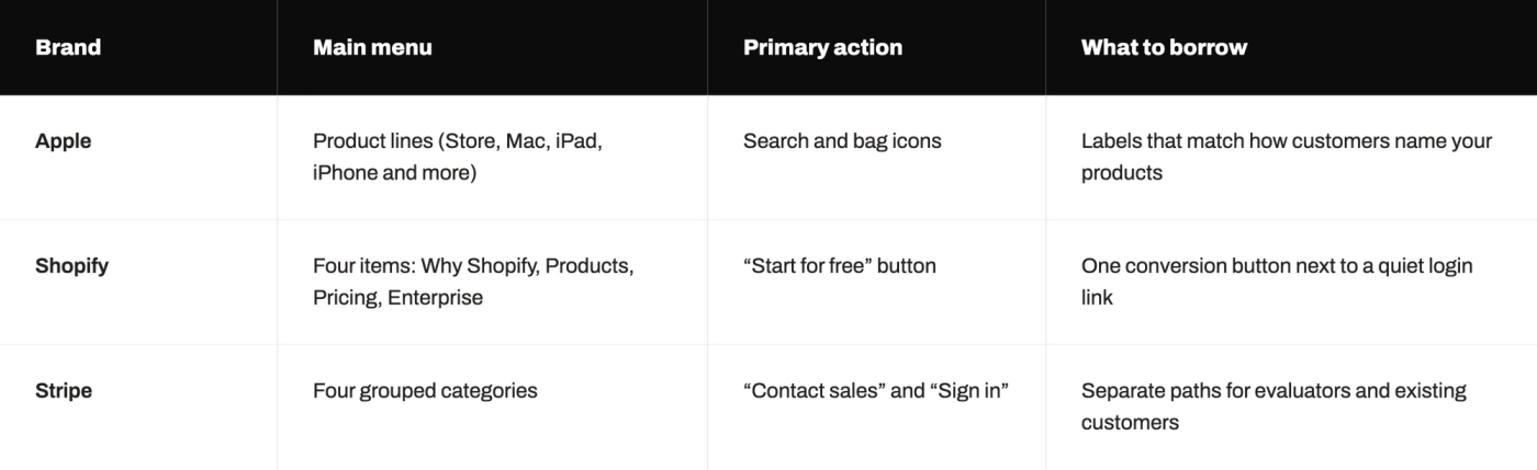
Apple, Shopify and Stripe show three ways to build a clear header. Each keeps the logo on the left, uses short labels and gives returning users a fast path to their account or cart.
Apple
Apple lists its product lines directly in the header: Store, Mac, iPad, iPhone, Watch, Vision, AirPods and more, followed by search and bag icons. The labels match the names customers already use, so shoppers can jump straight to the product they want.
Shopify
Shopify keeps four menu items (Why Shopify, Products, Pricing and Enterprise) and pairs a “Log in” link with a “Start for free” button. The short menu leaves room for a single conversion action.
Stripe
Stripe groups its offer into Products, Solutions, Developers and Resources, then places Pricing, Sign in and Contact sales on the right. This split suits B2B buyers: evaluators explore the left side, and existing customers and sales-ready leads use the right.
For more visual references, see these website design trends.
How Website Headers Affect SEO and AI Search
Your website header affects SEO through crawlable links and semantic markup, and Google applies the same basics to its AI search features. Because the header repeats on every page, any mistake in it repeats too.
Crawlable Navigation Links
Search engines discover pages through links, and header links appear on every page of the site. Google’s documentation states that it can generally crawl a link only when it is an <a> element with an href attribute, and it recommends anchor text that is descriptive and concise. A menu that opens pages through JavaScript click events alone can leave important pages undiscovered.
Semantic Header and Navigation Markup
Wrap the header in a <header> element and the menu in a <nav> element. These elements tell browsers and assistive technology which part of the page is site navigation and which part is main content. The same structure lets screen reader users jump straight to the menu or skip it.
What Google Confirms About AI Search
Google confirms that AI search features rely on the same SEO basics as regular search. Its AI features documentation states that there are no additional requirements to appear in AI Overviews or AI Mode and that a page must be indexed and eligible to be shown in Google Search with a snippet. Three of the practices Google lists apply directly to the header.
- Allow crawling. Check robots.txt and any CDN or hosting rules so every page linked from the header is reachable.
- Use internal links. Google recommends making content easy to find through internal links, and the header menu is one of the most repeated link sets on the site.
- Keep labels as text. Google asks for important content in textual form, so menu items should be real text links, with icons used only as support.
Google does not describe menu wording as a factor for AI Overviews. Treat header work as a way to keep key pages crawlable and easy to find, and judge AI search results through your analytics.
Website Header Design Trends to Watch
Four header trends stand out for 2026: personalization, accessibility-first design, restrained motion and design systems that AI page builders can follow.
- Personalized headers. Some sites change the header button for returning visitors, for example swapping “Start free trial” for “Log in”. Test this carefully, since a header that changes too often can confuse people.
- Accessibility-first design. WCAG 2.2 added criteria on focus and target size that directly affect headers, so accessibility now shapes header layout from the first sketch.
- Restrained motion. Small hover and focus states help users see what is clickable. NN/g advises keeping a sticky header in place with little or no animation.
- Design systems for AI page builders. Marketing teams now build pages with AI tools, and those tools need a design system with clear header components to stay on brand. This guide on design system documentation for AI page builders covers the rules.
How Darwin Improved Navigation and Engagement for ABC Fitness
A header redesign pays off when it fixes how visitors move through the site, and the results show up only when tracking works. Many teams refresh the look of their navigation and still cannot tell whether visitors find pages faster.
ABC Fitness Solutions faced this exact problem. Its navigation was cluttered, key resources were hard to locate and Google Analytics tracking was unreliable. Darwin redesigned the site around intuitive navigation and clean layouts that work on mobile devices, and brought the analytics setup to fully operational. Within six months, user engagement rose 24% and sales rose 12%.
The lesson for any header project is to fix navigation and measurement together. Clear menus help visitors find the next page, and working analytics show which changes earned their place.
FAQs
Q1. What should a website header include?
A website header should include a logo linked to the homepage, a short main navigation menu and one primary call-to-action button. Depending on the site, add search, login, contact details or a language selector, and keep everything readable on mobile screens.
Q2. Should a website header be sticky?
A sticky header helps on long pages where visitors need the menu often. Keep it slim and opaque, avoid distracting animation and make sure it never fully covers focused elements, as WCAG 2.2 requires under success criterion 2.4.11.
Q3. Where should the logo go in a website header?
Place the logo in the top-left corner and link it to the homepage. Nielsen Norman Group found that users were 6 times as likely to fail to reach the homepage in one click when the logo was centered.
Q4. How many items should a header menu have?
Keep the main menu short. Five to seven top-level items is a common guideline, and the right number depends on your content. Group related pages under clear labels and move secondary links, such as careers or legal pages, into the footer.
Q5. Can a bad website header hurt SEO?
Yes. Header links repeat on every page, so a menu built without standard links can stop search engines from discovering key pages. Google can generally crawl only links built as anchor elements with an href attribute, and its AI features use the same crawling basics.